mid-century modern facade makeover- all’s well that ends well

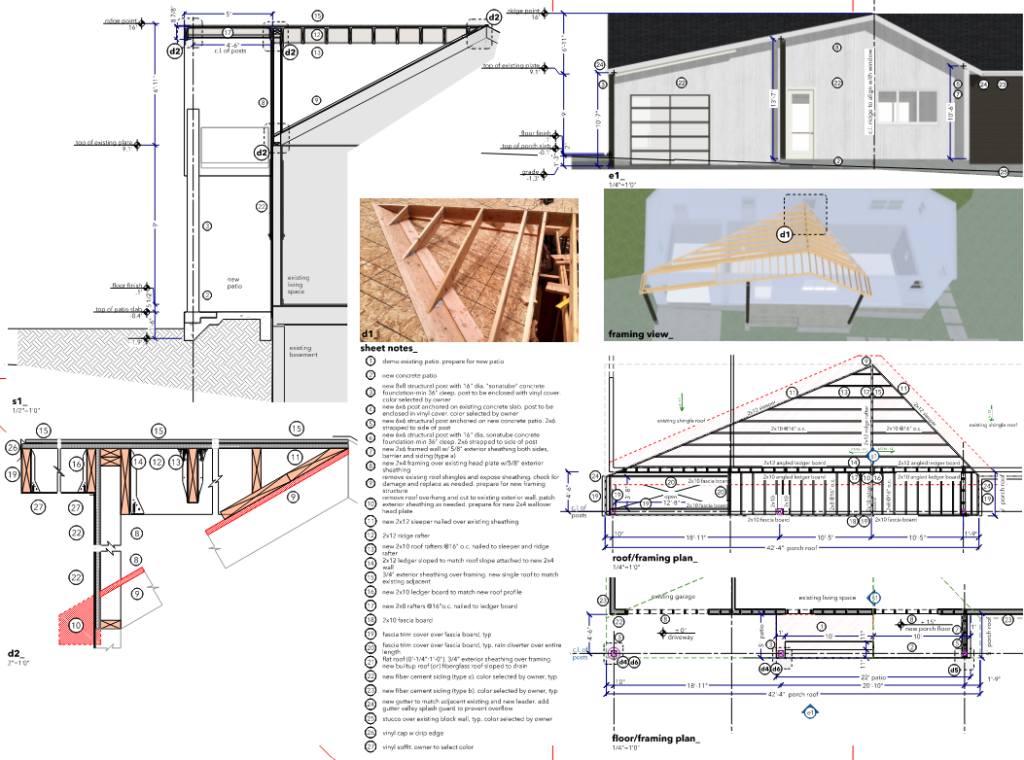
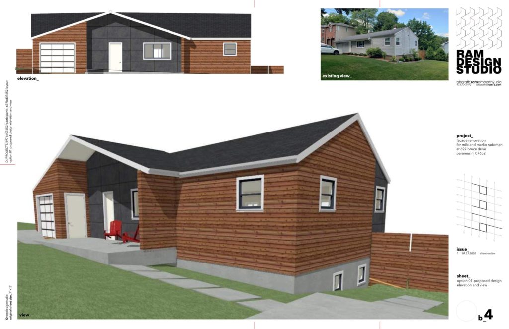
at the end of the design phase, a very happy client is moving forward with the renovation based on a final design that balanced design proportions, structure, and budget.
mid-century modern facade makeover-some more choices

the clients fell in love with this idea. from then it was an exercise in proportion and materiality. from 02 there came 03 iterations, along with a small rear canopy…
mid-century modern facade makeover-choices, choices, choices…

02 (:)) options were shared with the client, along with inspiration and some initial material ideas.
mid-century modern facade makeover-before it all began

re imagining a 70’s ranch house as an mid-century makeover needs a lot of creativity and of course, tons of images. here is the start….
steel porch

Malcolm Davis Architecture the residence comprises two wings: one hosts the living areas and the other the bedrooms. These are set at angles and feature large windows to make the most of the elevated vantage of the water on the western side.
house-k

K2YT (Keisuke KOIKE + Takuichiro YAMAMOTO) By incorporating the courtyard spaces into the house in the same manner as rooms, sufficient depths are provided from the streets, successfully shielding off views without use of curtains even for the largest fenestration. https://archello.com/project/house-k-13?fbclid=IwAR2kcTg9e-EduWhXaA2rmm_aglGbfeShz-FxNFGp_hJF8frWVmyYwF5UmrM
kaleidos house

Taller Estilo Arquitectura (Estilo Arquitectura) The architectural solution of “kaleidos House” results in a unique, contemporary home, full of surprises and spatial sensations that make daily life a pleasure despite the challenge of working a lot with such particular dimensions. https://archello.com/project/kaleidos-house?fbclid=IwAR2zdEYCH4rsB4f2Fxid_92BZQcIGQDvLVfD5YXHG-Wjy1hfW6EJKKT2nFY
